
Typing "make this look better" into ChatGPT almost never returns a better photo. Typing the exact mood you want, with the light, color, and grain spelled out, is a different story. Every prompt below was run through ChatGPT's built-in image editor on real portraits, street shots, and interiors, then adjusted until the look held up instead of falling apart on the second try. What is left is twelve copy-paste prompts, sorted by feeling, each built to do one specific thing well. Upload a photo, paste the one that matches the mood you are after, and change a single detail at a time. One thing to keep in mind first: ChatGPT reads your wording literally, so each prompt here names what should change and what should stay the same. That is the whole reason they work.
How ChatGPT edits photos right now
Verified, not guesswork
|
Five habits that sharpened every result
| Name the mood and the mechanics | "Warm and cozy" lands far better when the light direction, color temperature, and grain are written out too. |
| Edit in passes | One change per prompt stops the model from trading a fix in one spot for a new problem somewhere else. |
| Lock the face | Add "keep facial features unchanged" so the person stays recognizable through a heavy color grade. |
| Borrow a reference | Naming a film stock or a lighting setup, like side light or Kodak Portra, steadies the color from the start. |
| Use Select for local fixes | Mark one area and only that area changes, leaving the rest of the frame exactly as shot. |
The 12 prompts, grouped by mood
Each box is ready to paste after you upload a photo. Tap copy, drop it into ChatGPT, then tweak one detail if the look needs a nudge.
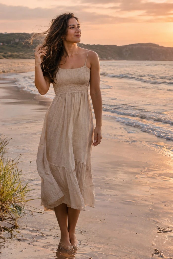
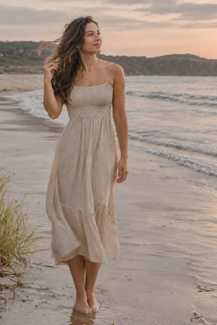
The master image used to run all the prompt is:
Warm and golden
1. Warm and cozy When to reach for it: indoor portraits, autumn scenes, anything shot under warm lamps.
What the test showed: landed on the first try most often. Watch that skin does not tip orange, and pull the amber back a step if it does. |
Result:
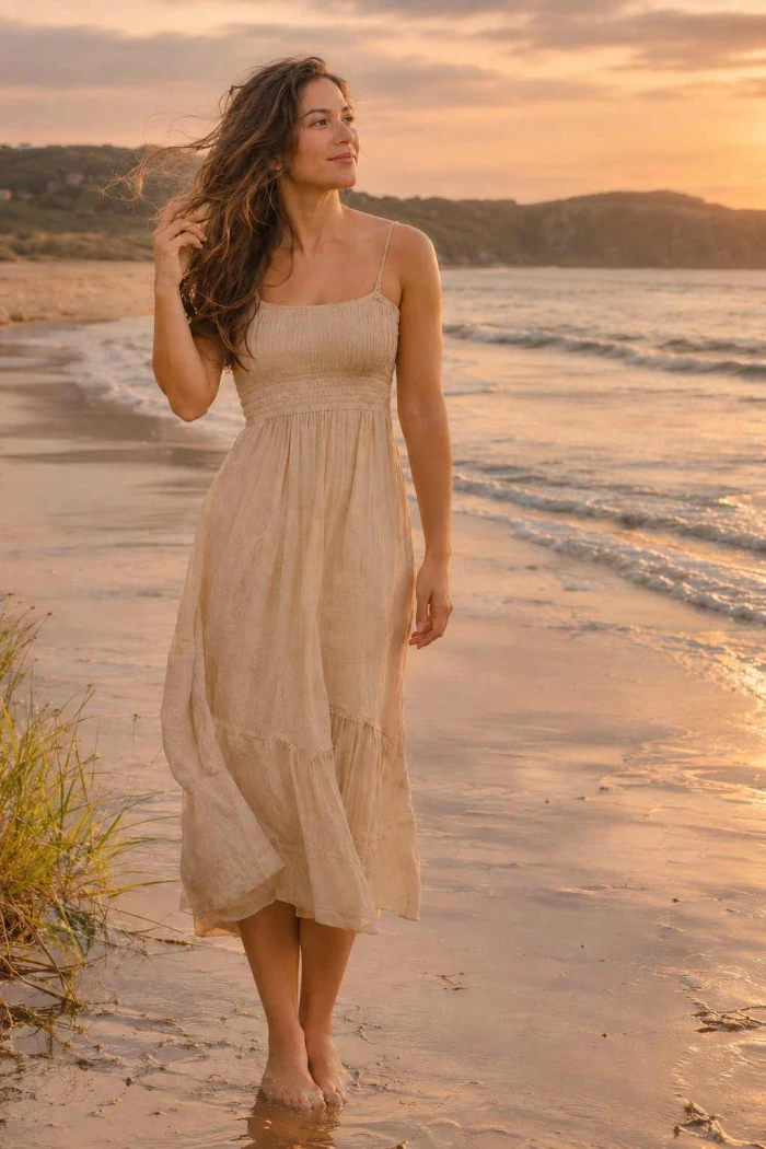
2. Golden hour glow When to reach for it: outdoor portraits and landscapes shot in flat midday light.
What the test showed: convincing side light and haze. Faces can pick up an orange cast, so keep the "naturally lit" line in place. |
Result:
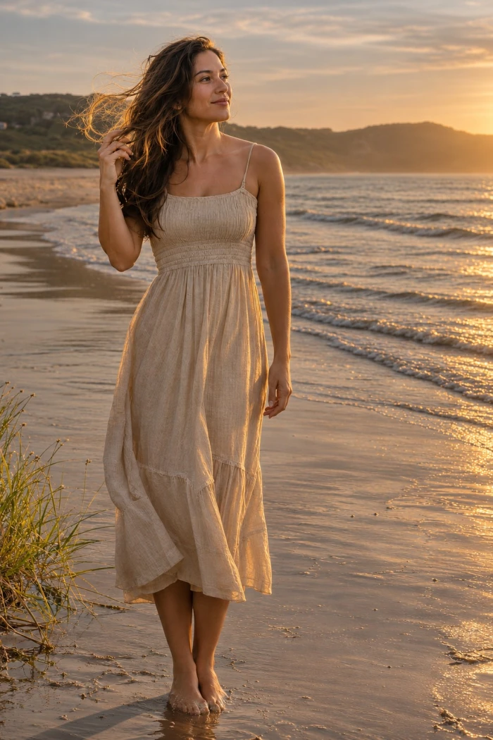
3. Vintage 35mm film When to reach for it: everyday and street photos that feel too clean or digital.
What the test showed: the faded tones and grain read as real film. Exact stocks are approximated, not matched to the last detail. |
Result:
Cinematic and bold
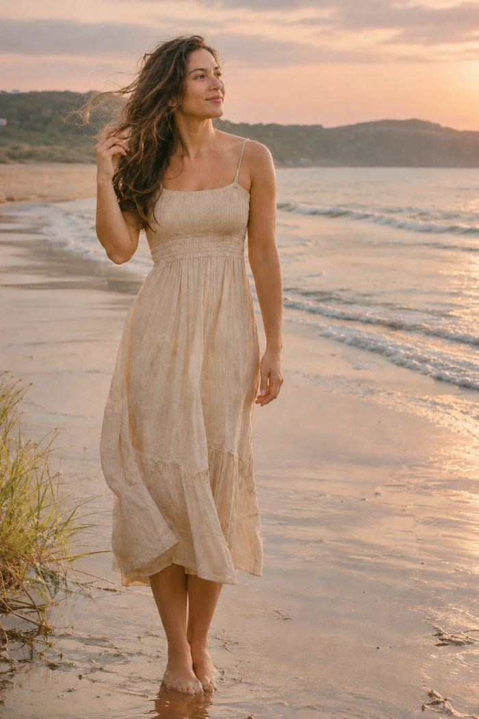
4. Cinematic teal and orange When to reach for it: travel, street, and portrait shots that want a movie-poster feel.
What the test showed: strong and believable at a light touch. Push it too far and greens go muddy, so keep the grade subtle. |
Result:
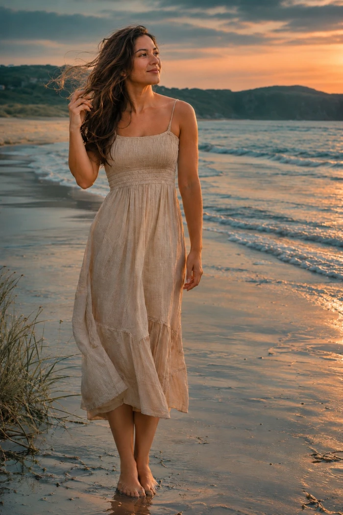
5. Editorial high fashion When to reach for it: studio portraits, outfit shots, anything meant to look like a magazine page.
What the test showed: clean contrast and refined skin. Fabric texture sharpens well, and faces stay natural rather than plastic. |
Result:
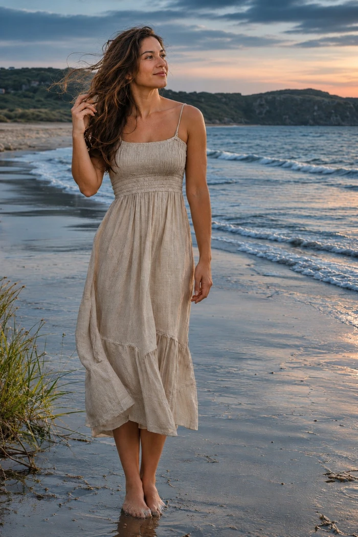
6. Bold and punchy When to reach for it: food, products, and posts that need to stop a scroll.
What the test showed: high impact without going cartoonish. Keep an eye on reds, which saturate the fastest of any color. |
Result:
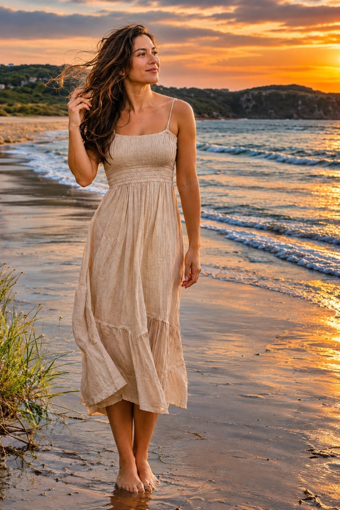
Soft and dreamy
7. Bright and airy When to reach for it: interiors, weddings, and lifestyle photos that should feel light and open.
What the test showed: crisp whites and open shadows. Very bright windows can clip, so hold the "avoid blowing out" instruction. |
Result:
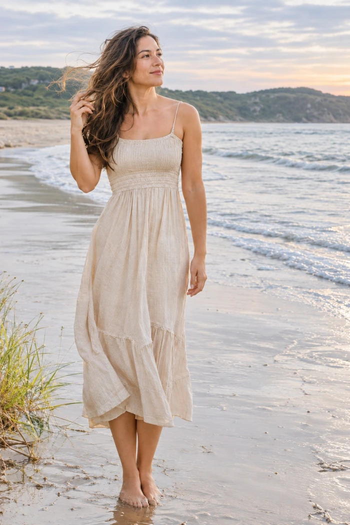
8. Dreamy soft focus When to reach for it: portraits, florals, and romantic frames.
What the test showed: the haze and bloom feel intentional, not like a mistake. Keep the face sharp so the subject stays clear. |
Result:
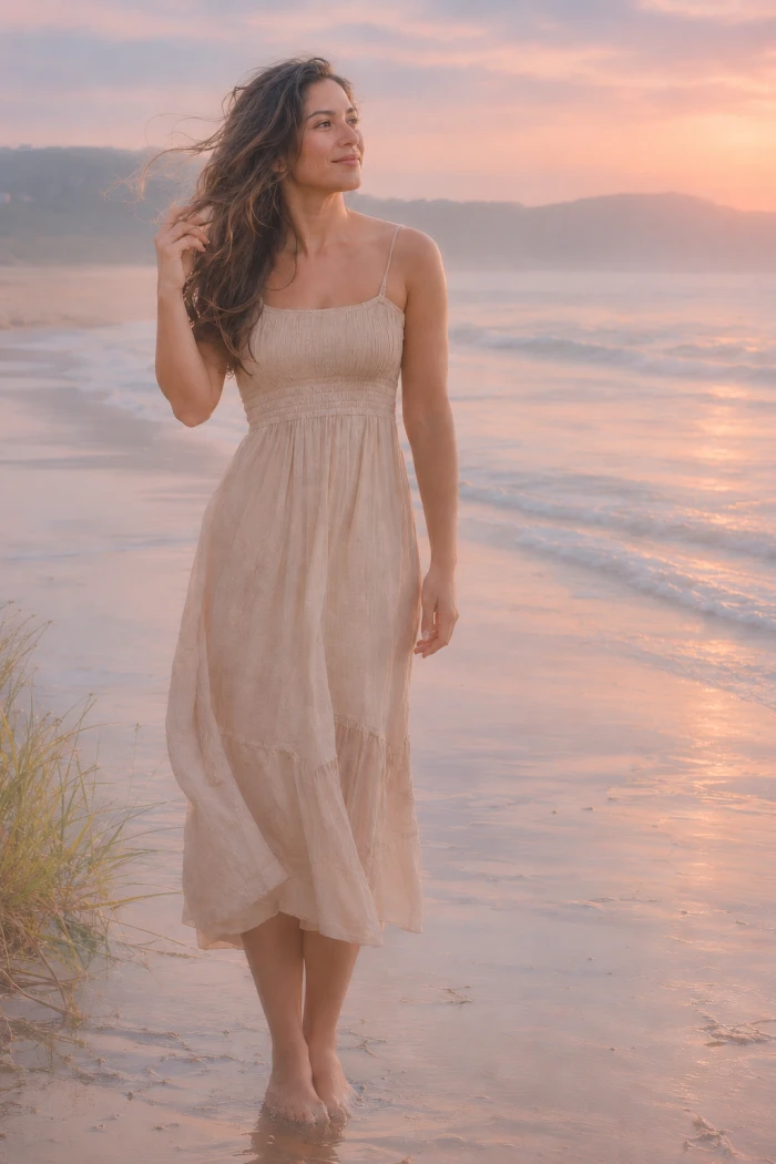
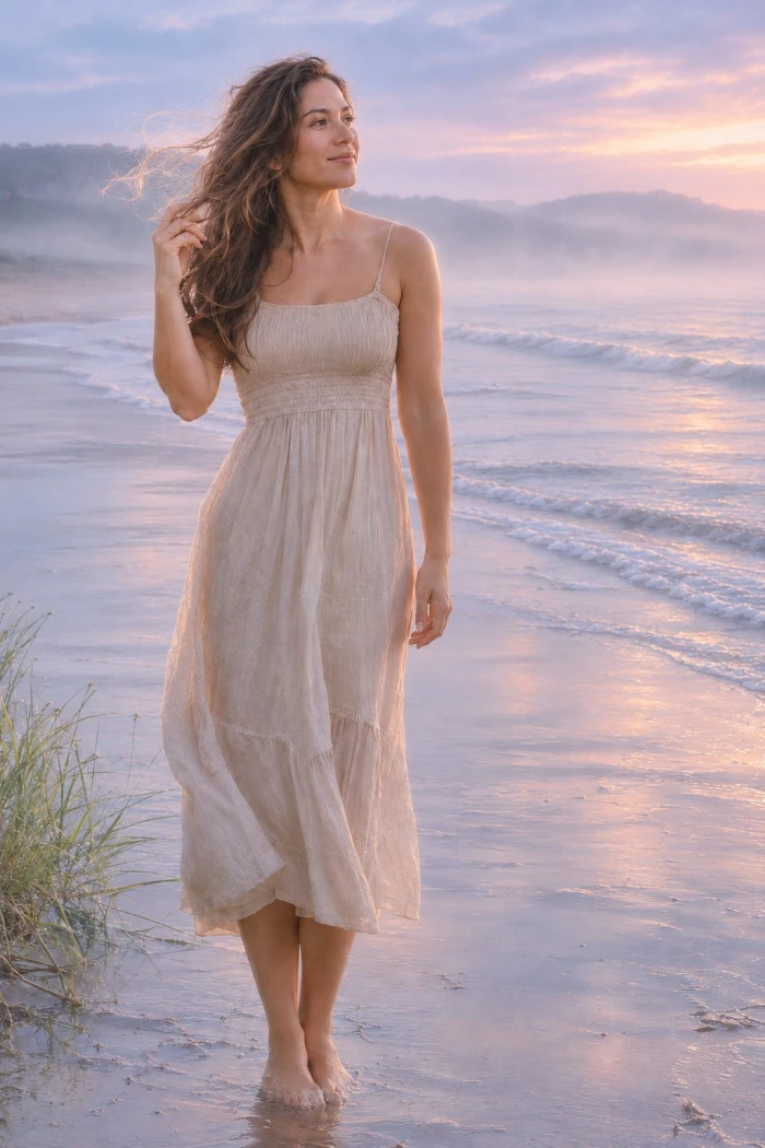
9. Ethereal fairytale When to reach for it: outdoor portraits and fantasy concepts.
What the test showed: soft glow and mist land nicely. Too much and the subject loses definition, so cap the haze if it spreads. |
Result:
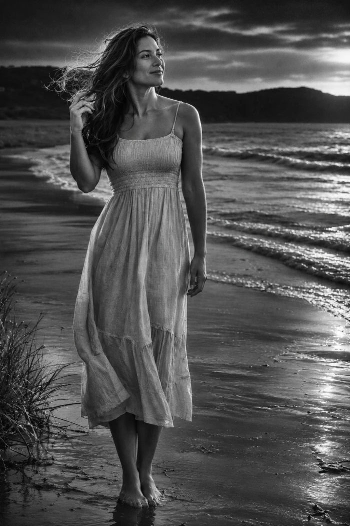
Moody and retro
10. Moody film noir When to reach for it: black and white portraits and architecture with strong shapes and shadow.
What the test showed: one of the most consistent looks here. Deep blacks keep their detail when you ask it not to go flat. |
Result:
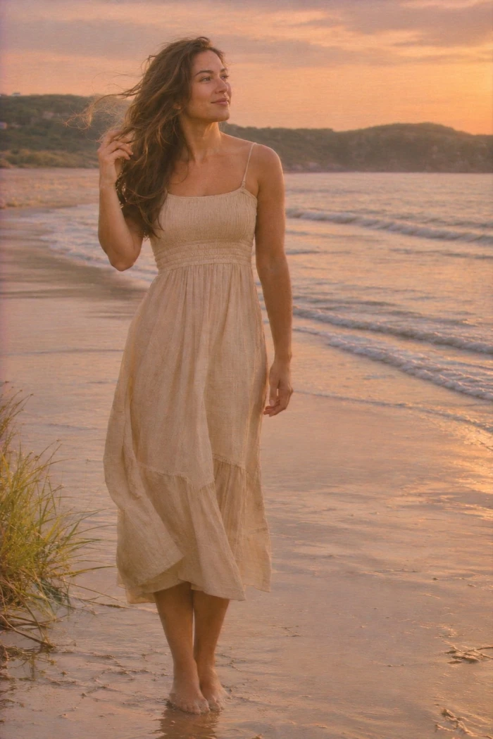
11. Nostalgic 90s camcorder When to reach for it: candid and fun shots that suit a retro throwback.
What the test showed: the softened, recorded feel is accurate. Avoid stacking heavy distortion on top, which tips it into a gimmick. |
Result:
12. Minimal and muted When to reach for it: neutral feeds, editorial sets, and calm lifestyle photos.
What the test showed: understated and clean. If it reads washed out on your photo, nudge the contrast up a single notch. |
Result:
Quick reference
| Mood | Best for | The look |
| Warm and cozy | Indoor portraits, autumn | Amber glow, open shadows, soft grain |
| Golden hour glow | Outdoor portraits, landscapes | Side light, gold highlights, sunlit haze |
| Vintage 35mm film | Street, everyday | Faded tones, halation, Portra palette |
| Cinematic teal and orange | Travel, portraits | Warm skin, teal shadows, light letterbox |
| Editorial high fashion | Studio, outfits | Crisp contrast, cool palette, refined skin |
| Bold and punchy | Food, products, social | High vibrance, deep shadows, sharp subject |
| Bright and airy | Interiors, weddings | Lifted exposure, clean whites, low contrast |
| Dreamy soft focus | Romantic portraits, florals | Haze, bloom, pastel, low contrast |
| Ethereal fairytale | Fantasy, outdoor | Soft glow, mist, cool pastels |
| Moody film noir | B&W portraits, architecture | Deep blacks, grain, high contrast |
| Nostalgic 90s camcorder | Candid, retro | Softened, VHS grain, warm shift |
| Minimal and muted | Neutral feeds, editorial | Low saturation, matte finish, lifted blacks |
What held up, and what needed a second pass
Held up across tests
| Needed a second pass
|
Final verdict
| After running the same handful of photos through all twelve looks, one pattern was hard to miss: the prompts that named light direction, color temperature, and grain beat every one-word request, every single time. ChatGPT is at its best here for speed and mood, turning a flat phone photo into something with a point of view in a few seconds. It is not a stand-in for a real editor when pixel-level control is the goal, and dense text or crowded group shots still want a second pass. The move that saved the most redos was plain: lock the face by asking it to keep features unchanged, then edit in passes instead of one giant prompt. Treat these twelve as starting points, swap in your own film stock or lighting notes, and the hit rate climbs fast. |

Join the discussion